Press Release
Here is a press kit I have compiled with my final chosen pieces. These items include:
Brand logo
Letter Head
Swing ticket
Business card
Look Book
Mission Statement
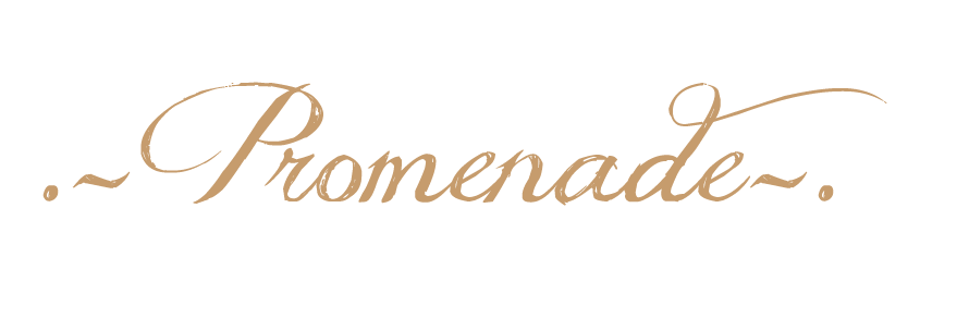
This is my chosen logo. I have opted for a simple yet elegant design. I feel this logo encapsulates the essence of my brand which is timeless glamour. It's a simple logo which is easily identifiable; An important aspect of any upcoming brand.
Consumers are constantly surrounded by media, and many digital related processes (e.g. Photoshop and Indesign) are made available to them. Consumers are in awe of the never-ending possibilities that modern software can create. However, I feel that consumers are growing tired of always being bombarded with special effects; and a new found appreciation for illustration is now apparent and consumers are especially drawn to the likes of Lanvin and British Vogue's playful illustrative format. This logo reflects that appreciation for illustration. I want consumers to look at my image and instantly think of the brand.
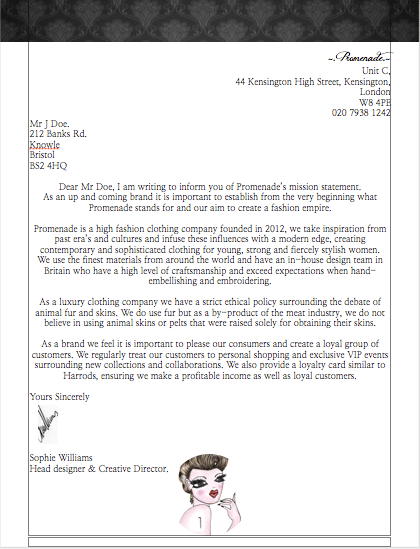
This is my final letterhead. Again I want to be in keeping with my brand identity. I reinforced my identity by including a small image of my logo at the bottom of my page. Originally I wanted to use a large image of my logo and lower the opacity to make it look like a watermark. However when I experimented with this idea it didn't look quite right and I felt that it looked as though an amateur created it. The small image at the bottom of the page in an invisible circle border looks much more professional.
I like the border at the top of the letterhead as I think it acts as a frame. Again it is in keeping with the image of the brand and makes the letter head look like an official company letter.
I think the letter head looks aesthetically pleasing, it has many interesting features but doesn't distract the viewer from the main focus of the letter. I think that is what makes a 'strong' letter head.
I have chosen this business card as my final design. It's a simple business card in that it has the brands logo and the name on the front of the card and one contact detail placed in the centre of the back of the card. The design of the business card is clean and straight to the point. The card does not overwhelm you with lots of information and images, the design of my buisness card is aesthetically pleasing to the eye. The brand logo suggests some relation to fashion due to her heavily 'made up' face and haute couture pose. The illustrative logo is refreshing and instantly draws in the viewer. I have chosen to only give out my web address as my contact detail. We live in a digital age, consumers and important prospective clients can browse the website to find exactly what they're looking for and if they wish, contact me directly using the contact page provided. By putting the smartphone hieroglyphic symbol on the business card, it allows the viewer to have instant access to the promenade website. By putting the symbol on the back of the card, it enables me to stand out from other competitors and take full advantage of the interactive and promotional resources available to me.
I imagine the business card to be presented on plain smooth matte card, again reinforcing the idea of simplicity and class.
I don't think I have created a particularly innovative or interesting look book, but it does however, draw in the consumer with its warm photographic tones and hues. It is a fairly simple look book illustrating the main focus of the shoot, which is the heavily embroidered folk skirt. I largely took inspiration from the clothing company, Toast. I felt that Toast and Promenade share a similar ethos and identity. Like Toast, I wanted to create a look book that offered some form of escapism and enticed the viewer with an atmospheric and ethereal feeling. I achieved this with the styling and the lighting. The lighting is soft and inviting showing undertones of warm yellow hues and pure white. The skirt is styled with luxurious clothing and accessories trying to keep in mind the ethos of the brand (class and luxury). The main point of a look book is to showcase the brand's best items of clothing and to try and sell as many clothes as possible. Look books do this by creating pages which pair items of clothing together, giving the consumer ideas of how to wear that particular item or how to style it. I tried to incorporate this idea when styling my look book.
One of the most impressive features of this look book is the photography. I collaborated with a good friend of mine who is a talented photographer. I think she captured the essence of the shoot perfectly. I liked the crystal clear lens and how it beautifully showcased my folk skirt. I thought that there were some interesting angles e.g. the mirror and the folk skirt, that entices the consumer. Without great photography, this look book could look boring and amateur.
I imagine this look book printed onto thick matte card. Due to its simplicity, the look book can easily be printed and showcased online.


This is my chosen swing tag. I have chosen to show an extreme close-up of my logo's face. I don't think it is a particularly strong swing tag, but I want to make my brand identity coherent, I think it is important to establish an up and coming brand. perhaps as the company grows, a more extravagant design will take place, really pushing forth the opulent identity of the brand.