After looking at my initial research, I have decided to target my company as a high-end designer brand, appealing to the upper class market.
I would very much like to go in the direction of chic and classic designer brands such as Valentino, Dior, Louis Vuitton and Elie Saab. I feel these brand names connote luxury and timeless opulence.
Before I go any further I must think of a brand name. One of my favourite designer brand names is ‘The Row’. A brand created by the famous Olsen Twins. I feel that this is a strong brand name. It is short and memorable and has connotations of exclusivity, luxury, high quality and high-end. It is suggestive of a place where you would want to be and where you would want to be seen. It is chic and yet mysterious. The type of connotations that you draw from this brand name is what I would like to achieve in my own brand name.

Another favourite brand name of mine is ‘The Shit Shop’ founded by uber-cool blogger, Bonnie Strange. Although this name is original and unconventional, it is meant to be slang for ‘cool’, it does not connote high-end, it creates an idea of alternative clothing which is eclectic and for high street consumers with a strong sense of personal style. However, ‘The Shit Shop’ is not meant to be taken seriously like ‘The Row’. It is meant to be a quirky, fun and unique label which perhaps appeals to loyal fans of Bonnie Strange. The name itself could be quite offensive (especially to those from a different generation) to some consumers and may also confuse others. Some people may not understand the concept behind the name and may put of potential loyal customers. Although I like the name (perhaps that could be down to the fact that I am a huge fan of Bonnie Strange) I feel it does not fit in to what I want my brand to signify.

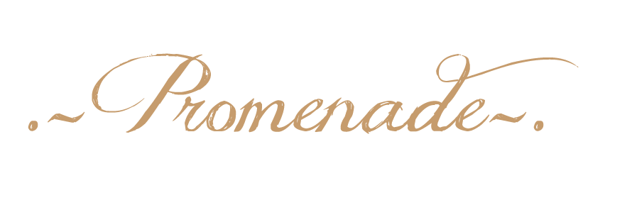
I have decided on the brand name; Promenade.
prom·e·nade
n.
1. a. A leisurely walk, especially one taken in a public place as a social activity.
2. a. A formal dance; a ball.
3. a. A march of all the guests at the opening of a ball.
I feel it encapsulates the essence of what I want my brand to be. It signifies a place to be and a place to be seen. For me, I feel it signifies high-class, exclusivity and luxury. It is simple and memorable, something that is important when creating a high-end brand.
Like ‘The Row’, it sounds similar to a walkway where high-end stores are situated (very much like Saville Row). I feel this concept could be translated to many countries such as France, Britain and Italy which locates high-end brands on particular streets (cosmopolitan).
The definition of the word (which is displayed above) again reinforces the idea of lavishness.
Now I have decided on a name for my brand, I need to start creating a press package. The brief requires me to choose three items to create for a press package. I have chosen a logo, business card and swing ticket. We create these items using Photoshop on the Apple Mac.
To generate ideas for the logo of my brand and a particular font to use on my business card, I have used the website ‘DaFont’. This website is great for choosing particular fonts for certain things, it has everything from medieval Celtic fonts to calligraphy.
It was hard for me to choose just one particular font as I was drawn to the powerful celtic/gothic text; however I felt that i needed a softer looking font and thought that I'd need to have some kind of celtic connection if i was to choose the celtic/gothic text. In the end I have whittled my choices down to just three different fonts inspired by calligraphy as i felt it captured the essence of my brand.
Here are my choices…
The first font looks like someones handwriting and quite casual, but I am not sure if it's quite what i'm looking for.
I like the second font with the delicate swirls on the letters P and D.
The third font perhaps is my favourite, it definitely looks like the most luxurious of all the fonts, it also faintly reminds me of the text on front of a Jane Austin cover. I love the elaborate swirls and how one letter beautifully links to the next.

My brand is targeted at a young female audience who ages from 20- 30 years old. Promenade’s customer is a young female with a lot of disposable income who has an innate sense of sophistication and elegance. The demographic of the consumer is mainly based in London; particular areas are Chelsea, Kensington, Notting Hill and Mayfair. Promenade’s customer loves high quality products and attention to detail and mostly shops in Knightsbridge and Bond Street, buying products that are timeless and have certain unique characteristics. Promenade’s customer has a great understanding and appreciation of garments which are exclusive due to its craftsmanship and attention to detail; investing in vintage designer clothing and garments which have been hand embroidered and hand embellished.
The ‘Promenade Girl’ is a woman who strives for the best in everything she does. She is successful and confident in whom she is. She has a taste for the finer things in life and spends her time immersing herself with luxury spa retreats, gourmet fine dining and socializing in chic bars. She works hard and plays hard.
The ‘Promenade Girl’ is confident and has a distinct sense of style, she wears beautiful clothes that maps around the curves of her body, and they are unique pieces of clothing that evokes elegance and glamour. She loves accessorizing and the jewellery she wears often makes a statement. The ‘Promenade Girl’ takes pride in her appearance and pays homage to earlier eras where women would look effortlessly glamorous at all times.
Promenade’s customer does wear fur and real leather, however, she will only wear it if it is a by-product of the meat industry, she does not agree with wearing skins or pelts of animals that has been raised for the sole purpose of their skins.
Promenade is a high fashion women’s clothing brand that targets customers with a lot of disposable income and who are young with a strong sense of style.
It is primarily located in London in Bond Street, Knightsbridge and Oxford, but does have a range of concessions in department stores such as Harvey Nichols and Harrods.
Promenade is renowned for creating timeless pieces which evoke elegance and glamour; garments which have great attention to detail and are of very high quality. Everything is hand-embellished and hand-embroidered.
Promenade takes inspiration from different cultures and past era’s infusing these influences with a modern twist.
Promenade prides itself on being a luxury clothing brand; and sources its finest materials from around the world. Promenade does not use skins or pelts of animals which are raised solely for obtaining their skins. Any fur or leather is used as a by-product of the meat industry. Because of the brand’s British heritage, all clothing and fabric is made in the UK, ensuring the best quality of garments and best treatment of our workers.
Promenade is an exclusive brand where its products range from £75.00-£2,000. However it does have a range of bags, shoes and accessories that are affordable to those who have less disposable income than the intended target market.
Promenade is known to draw in a young market and tourists by displaying elaborate window displays and innovative, edgy campaigns very much like Chanel (under the direction of Karl Lagerfeld). Due to its exclusive nature, Promenade rarely promotes special offers like high street stores, however it does offer a loyalty card and special VIP treatment in-store and holds regular events that highlight new collections and collaborate with upcoming designers.


This diagram is a study of our eye movement when we first view a webpage. Companies use this diagram as a guide to create an efficient, popular website that attracts lots of views. The eye starts at the very top which is most likely the masthead, from the masthead the eye travels briefly towards different features on the webpage such as, top features/stories, navigation links, banner ads and external links. The eye then finishes by looking at the side bar (most likely to be the menu).
This is a great tool to keep in mind when designing my website.

From looking at many different brands and how they promote their material, I noticed that they have specific colours to differentiate themselves from other companies and to make their company recognisable for instance, when you think of red and white, Clarins comes to mind, pink and navy instantly paints an image of Jack Wills
I also wanted to have a specific colour combination.
I played around with different colour combinations on Photoshop, initially I wanted colours that exude luxury like gold, red and green, however it just didn't look right or innovative.
I showed my colour cards to a small audience and finally chose the combination of 'champagne' and indigo. However when i applied these colour choices to my buisness cards and website design, it looked flat and uninteresting;it did not draw the target market in. I have now changed the theme to black and gold. I feel it is chic, sophisticated and timeless. I applied a luxurious vintage inspired wallpaper to my website background to add texture, it instantly draws you in and exudes luxury.
Here are a few examples of my colour cards...
This logo is synonymous with the legendary brand. It was created by Karl Lagerfeld when he took rein of the fashion house. It is a simple yet effective idea that has proven to be memorable. The muted colour palette of black and white is synonymous with Chanel. It creates a clean, timeless and chic image which also appears to stand out, again making it memorable for the consumer. I have found that many high end brands, (particularly the other examples I have shown below) use a muted colour of black and white. The Chanel symbolis a great example of a strong designer logo. When a consumer sees this image, they automatically think of the brand and its history.
The consumer sees:
High end
Coco Chanel
LBD
Legendary brand/designer
Class
Modernity
Karl Lagerfeld
Innovative
luxurious
McQueen is already becoming a legendary design house and has still proved to be successful following its original founder’s death. The logo is clever in the fact that it contains the brands most important initials in a clever distinct way that is instantly recognisable. It's a strong logo as it's straight to the point and contains a gothic font which consumers recognise as 'typical McQueen'. When the consumer sees this image, they automatically think of the innovative creations of the brand.
The consumer sees:
Innovative
Creative
Ground-breaking
Lee Alexander McQueen and his death
Sarah Burton
Designer
British
The Row is a relatively new brand created by the famous Olsen twins. The name is meant to pay homage to the renowned shop, Saville Row. Unless you are a great lover of fashion and a big fan of the Olsen twins, you may not create an instant image of what the brand signifies.
It's a great logo, it's clean and chic, it may not be instantly recognisable as it is a relatively new brand but has a lot of potential.
The consumer may see:
Fashion
Olsen twins
Celebrity brand
Tailored clothing
Minimalistic
chic


Here are a few examples of letter heads I have collected. The layouts are clean, simple and formal. They all have the brand name or logo displayed clearly across the top of the page. This reinforces the brand's identity and makes it clear to the reader who the sender is. The brand's address and contact details are placed on the top right hand side and the recipients on the left. The letter head usually finishes with the writer's signature and name in print.
The first letter head I have collected is Natwest. I like how the logo extends as a bar across the top of the letter, catching your attention and framing the letter. I like the simple layout of the letterhead and the signature gives the letter a personal touch. Although the main objective of this letter is informational and formal, I'd want my letter head to grab the reader's attention and to feature interesting parts. Unlike Natwest, Conde Nast Publications have displayed their letter head in a similar matter but instead of using a coloured bar to frame the page, they have clearly displayed their company name across the top centre. Again the sender has used his signature to add a personal touch.
The last letter head I have collected is a NUS campaign letter. This letter draws you in with its small doses of colour and the friendly and personal touch of inserting the images of the senders. Again the letter format is simple as it is informing you of their campaign in a formal manner.


Here are many examples of look books I have collected over the years. The most recent look book I am analysing is 'Toast'. Toast is a clothing brand that creates luxurious clothes with comfortable qualities, creating soft slouchy cardigans and fitted feminine coats. It's look books often create an atmospheric, ethereal mood which entices the customer and offers some form of escapism. The lighting is soft and displays either a slight blue hue or warm yellow tint. The models look young, healthy and fresh faced and are usually located in the great outdoors or in rustic looking country houses. Toast has a similar ethos to mine and I love that naturalistic and ethereal feel in their campaigns. The brand markets itself as simple sophistication, similar to my created brand. In terms of the brand's target customer Toast has done very well, keeping things to a minimum. I have used this look book as a big source of inspiration for my look book.
The next look book I have collected is Urban Outfitters winter 2010 look book. Urban Outfitters is known for creating hipster clothing with a contemporary urban edge. It's campaigns often involve young models who look like they are students. The models are styled in an edgy way whilst still looking casual and 'urban'. When looking at these images, ' design students' come to mind. The models are often located in a rustic, urban setting, reinforcing the brand's identity. The look book creates a story with a 'fun' atmosphere, making you want to be a part of that group.
The last look book I am using is Topshop from 2008. Topshop is known for creating quirky, edgy and feminine contemporary clothing, often mismatching prints in outfits and layering different textures and accessorises to spark ideas for their young consumers; as well as reinforcing their brand identity. Compared to the other look books, Topshop is the only brand to clearly identify the different trends as well as displaying their own take on the trend. This look book is displayed in a typical fashion studio using a plain white background and pure bright lighting; A strong feature as it forces you to focus on the clothes but also lacks innovation and imagination. The styling of the clothes in this look book is the best compared to Toast and Urban outfitters as it is playful and strongly identifies its target market. However Toast, Topshop and Urban Outfitters all have different target markets, which explains their way of styling. It is a strong look book and has many interesting features, however I feel like my brand is directed more in the style of Toast's atmospheric feel.
The images above are business card samples I have collected.
The first image is a small business card from a local stall in the Bath christmas market. The stall was full of unique and eclectic jewellery and has a kitch/vintage vibe. This is reflected in its business card. I was drawn to this business card as I thought the design was interesting and the warm colours are inviting. I love the illustrative elements and the vintage swirling text. This business card is strong as it clearly displays the identity of the brand, however I think this card could be improved if the brand name was embossed or etched onto the card as I feel it gives the brand a good first impression.
The next card I have collected is for a small cake company. I feel that this is a weak business card. It looks as if no thought has gone into it and I don't see any connection to the brand at all apart from the brand name. It is straight to the point as gives the brand name and contact details, however it looks plain and unimaginative.
The last image is of a beauty shop business card. I think it is quite a weak business card because of the way it is designed. It has simple straight forward details in how to contact the shop, but the illustrations and fonts used look as though an amateur has designed it.


Here are three swing tags I have collected.
The first swing tag is a classic rectangular shape with an illustration of the brand name clearly displayed. I think this is a cute swing tag and really illustrates the brand's feminine, flirty and boutique style. The brand clearly shows that it is targeted towards a female market.
The next swing tag was taken from a homeware product. This is my favourite swing tag as I feel it is the most creative and interesting. The tag is printed onto textured card and is scalloped around the edge which immediately gives a good impression and draws you in. The text is flirty and feminine and the illustrations create a cute kitsch/vintage and 'girly' feel.
The last swing tag I have collected is from Warehouse. This again is a standard swing tag. It is in the standard rectangular shape and is plain and simple. It is unimaginative, perhaps this is because it is a swing tag used for mass production.
Many brands, particularly high street companies, use strap lines to add to their brand identity and to make them memorable e.g. "Maybe, it's Maybelline".
However, I do not want to create a strap line for my brand as I feel it cheapen's my brand and does not fit in with my brand ethos.
From looking at my research, the brands I have picked to base my brand identity on e.g. Toast & The Row; do not have a strap line because they are already an established brand.
Here are some other promotional material I have collected during this ongoing project.