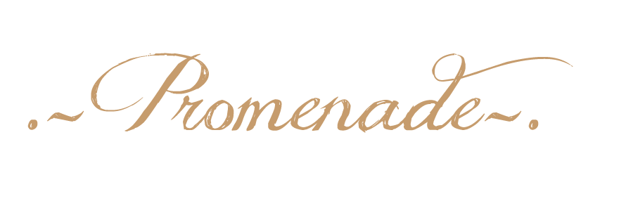
The Logo
I created this logo using Adobe Photoshop CS6. I was inspired by illustrations designed by Cassandra Rhodins. I loved the way her characters in the illustrations looked high fashion and have an air of sophistication about them. I also love the moody atmosphere she creates by making the characters look as if they're pouting whilst wearing thick layers of mascara. I also took inspiration from high fashion brands such as Lanvin as They also use an illustrative image to convey the mood and identity of their brand. They use their image as a psychologic association which proves to work very well, that is what I would like to achieve in my brand.
I drew this illustration free hand and then scanned it into the computer, I then used various brushes (such as the cloning tool, the smudge and blur tool) to create the look i wanted. I am pleased with the result and feel it has a unique commercial quality. It is quite a simple image and by repeating the logo on my letter heads, business cards and swing tags; it will reinforce the brands identity and will be quite memorable to consumers.

I like the shading of this logo and the muted colour pallet. I like how the logo looks high fashion yet commercial at the same time. It also nods toward Marie Antoinette. However, I didn't choose this logo because I felt although this was a nice illustration, it didn't feel memorable and the hair looked too historical.

This was one of my favourite logo designs. I like how this illustration has a cosmopolitan feel to it, it can easily be transcended to other cultures such as Spain, Italy and France. There's a certain atmosphere that draws the consumer in, a particularly strong element when designing an up and coming brand (as the logo seems memorable). Due to the lack of colouring or shading it was a useful blank canvas. I did not choose this design as I loved the sophistication of my chosen logo.

This is my least favourite logo. I like the artistic aspect of this illustration, however I did not think it was a suitable image for a clothing label. I thought that the character in the illustration looked anorexic and frail, I did not want my brand to condone such a negative look.
Rejected Logos